


Data Visualisation presents the information and data in visualised format – helping people to gain insights effectively. Data visualisation tools take data from one specific source and convert it into visual charts, graphs, dashboard and tables — from a simple pie graph to complicated interactive choropleths, data visualisation tools can create it all. The tool utilises visual elements like graphs and charts to make data speak. There are many data visualisation tools available in the market, but we’ve put together a list of the top 7 data visualisation tools to help you to visualise and analyse your data.
1. Visme
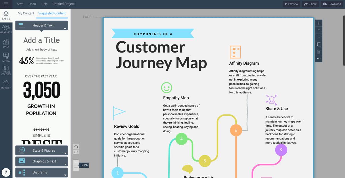
Visme is a data visualisation tool that goes above and beyond data. With the use of a complete set of tools, including a graph maker, chart templates and a data widget library, one can easily create a data visualisation of different types. One of the best parts is adding the visualisations to any project you are working on in Visme. For instance, a proposal, presentation, report or an infographic. Also, Visme integrates business intelligence with interactive design to help you create data visualisations that are easy to read and understand, and look stunning.
 Source: https://visme.co/
What can you do with Visme? Who is it for?
Visme’s graph maker comes with the power to easily create line graphs, bar graphs, pie charts, scatter plots, histograms and many more chart styles. The data widget in Visme is perfect for visualising map data, arrays, tables, percentages, gauges and more.
Visme is for anyone and everyone who needs to create data visualisations and visual graphics for various purposes.
2. Tableau
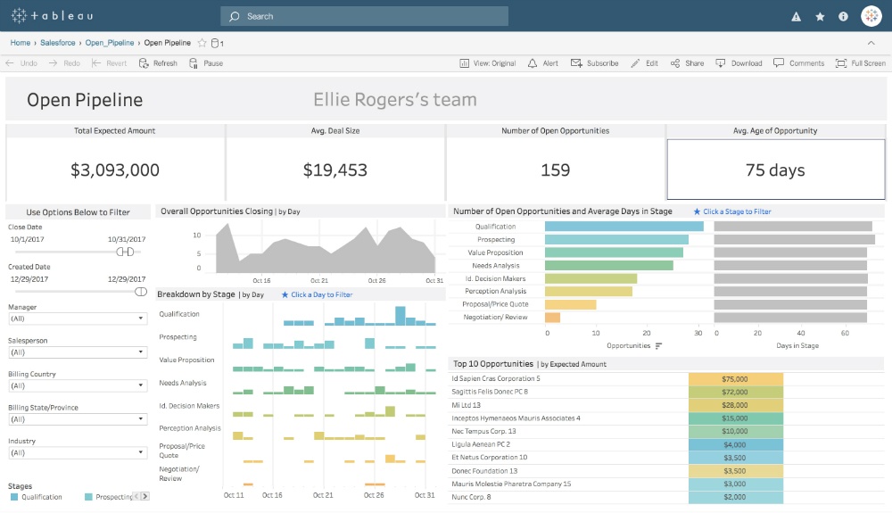
Tableau is one of the most recognised business information (BI) data visualisation tools. With Tableau, visualisation is at the core of everything. The data visualisation and data analytics tools inside Tableau have revolutionised the way businesses manage their data. The best thing about Tableau is that it offers private data analytics and visualisations for big data firms and corporations. Tableau also has Tableau Public – a free platform where one can create data visualisation. Data can be imported from a spreadsheet or entered manually.
 Source: https://www.tableau.com/
What can you do with Tableau? Who is it for?
You can create any type of visualisation with Tableau, from a simple chart to creative and interactive visualisations. The possibilities with Tableau are pretty much endless.
Tableau is technically for anyone interested in using data to drive business, community, the environment, and the world itself.
3. Infogram
Infogram, now part of Prezi, is a versatile online data visualisation creator. The tool offers varied and extensive options. Infographic’s data visualisation tool has been one of the favourites for a while because of its easy to use interface (UI). You can create straightforward data visualisations with Infogram. Also, the learning curve is relatively low.
 Source: https://infogram.com/
What can you do with Infogram? Who is it for?
Infogram has more than 30 types of charts and single maps to customise as you like. They have recently added social media graphics and other visuals to use with your visualisations. Infogram has a notable feature of the tool, that is the dashboard template library. These are projects with many visualisations in one place, perfect for taking company data and finding trends.
Infogram is basically for business owners who want to analyse their data and big companies which need to showcase data in projects, dashboards and reports. This tool is also suitable for content creators, students and journalists looking to visualise a piece of information.
4. Whatagraph
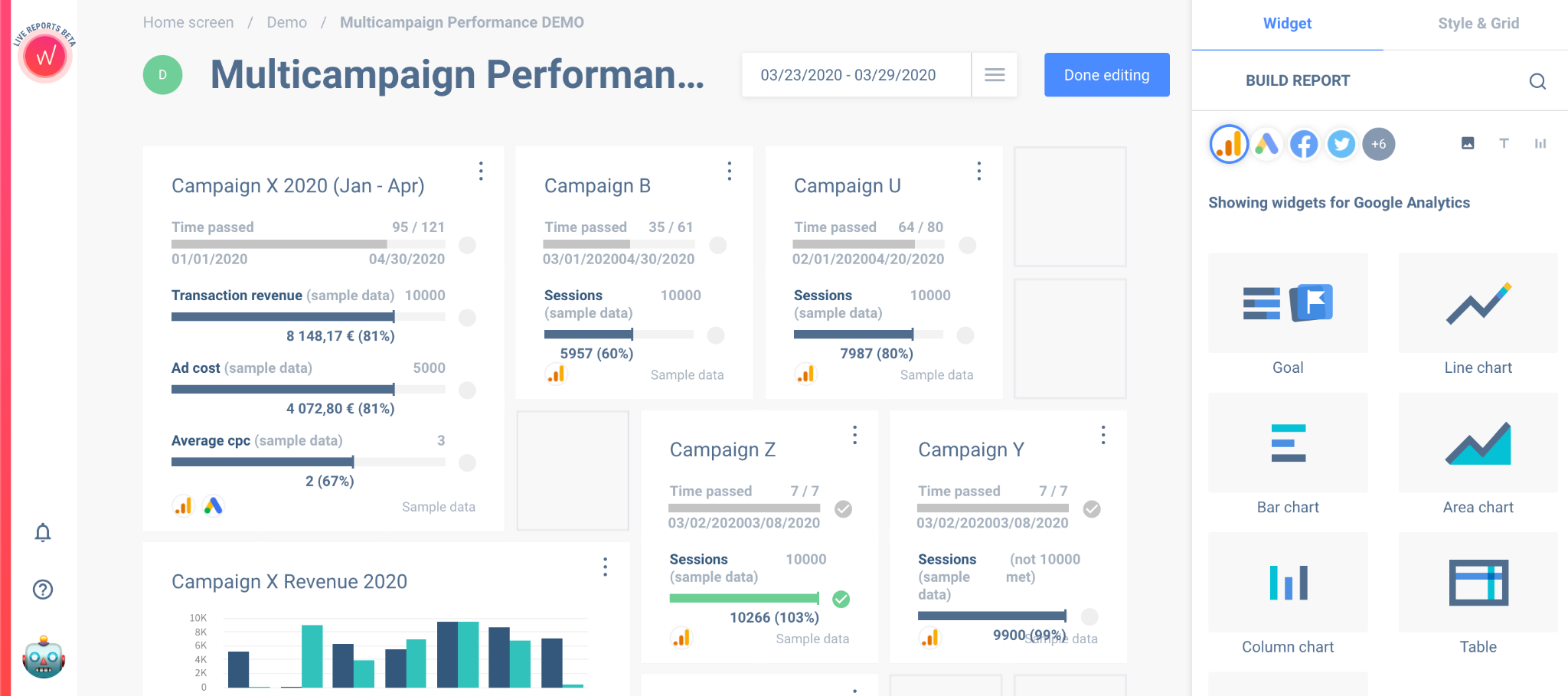
Whatagraph is a data visualisation tool that offers visual data analytics for social media, PPC, SEO and email campaigns. The visual analytics are created from several different integrations, spanning from Twitter to Google Analytics. The Whatagraph data visualisation can also be used to match your brand with white label templates by customising it.
 Source: https://whatagraph.com/
What can you do with Whatagraph? Who is it for?
The primary data visualisation feature of Whatagraph is to show and analyse social media and email marketing campaigns. You can integrate the tool with multiple different services and create branded analytics dashboards that look great.
Whatagraph is perfect for digital marketers who need to create visual dashboards for clients. By using integrations with different marketing channels, users can quickly put together reports and dashboards. It is also helpful for social media managers who want to keep track of all the social platforms they are using for campaigns.
5. Sisense
Sisense is a business intelligence tool for creating data visualisations that help gain business insights. Sisense’s capabilities go beyond creating dashboards. The tool is specially created to visualise large amounts of data. Developers can generate analytics apps using Sisense API with any sort of data set, which is helpful for larger corporations in health and manufacturing industries.
What can you do with Sisense? Who is it for?
With Sisense, you can create dashboards for tracking any type of data. From social media marketing to health, manufacturing and more. It offers interactive data visualisation widgets like Sankey diagrams, scatter plots and much more.
Sisense is for anyone who wants to visualise and analyse large data sets. The versatility of developers being able to create analytic apps as well as non-dev people being able to create dashboards is quite impressive.
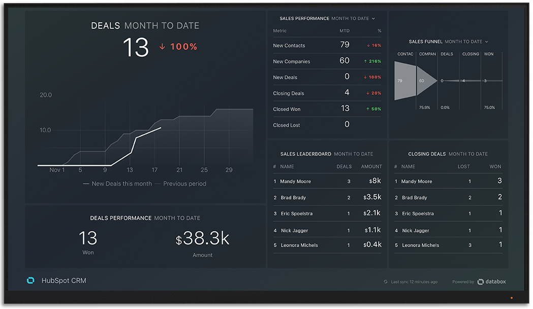
6. Databox
Databox is a data dashboard tool that’s less robust than Sisense. The data visualisation tool has a DIY dashboard creator with integrations for many data sources. Also, it offers plenty of templates to choose from. The styling of Databox is quite different from others.
 Source:https://databox.com/
What can you do with Databox? Who is it for?
Databox is exclusively for creating dashboards and analytics apps for mobile and desktop. The main messaging on the Databox website is how their tool helps data analysts predict performance. They also offer training in Predictable Performance for Business analysts.
The templates in Databox are geared majorly towards marketers, like HubSpot, Google Analytics and email templates. It is a great tool for business data analysts who want to track their team’s efforts.
7. ChartBlocks
ChartBlocks is an easy to use data visualisation tool for creating charts and graphs. Lately, it was integrated with Ceros, an interactive content creation tool. Users can access the charts from ChartBlocks from inside their Ceros dashboard or directly from the ChartBlocks site. Charts with ChartBlocks are hosted with D3.js and are fully responsive to share on any platform and to view on any device.
 Source: https://www.chartblocks.com/en/
What can you do with ChartBlocks? Who is it for?
With ChartBlocks, you can create any type of chart or graph. Their chart maker is fully customisable and can be adjusted to fit brand guidelines or a project’s colour palette. The data for the charts can be imported from spreadsheets or SQL or entered manually.
ChartBlocks is for anyone who needs to create a chart for a proposal, report or project. The data visualisation tool is relatively easy to use and the learning curve isn’t steep.


